Peter Mahnke
on 1 November 2019
Here are some of the highlights of our completed work.
Web squad
Web is the squad that develop and maintain most of the brochure websites across the Canonical. This was a very busy two weeks for the Web squad, especially with the exciting Ubuntu 19.10 release updates to be done.
Takeovers and engage pages
This iteration we built one webinar with engage page and one case study engage page.
What’s new in Ubuntu 19.10 webinar
We built a new homepage takeover along with an engage page to learn more about 19.10 release. The takeover is also linking to the download page where you can get the latest version of Ubuntu.
TIM case study
We posted a new case study about how TIM ensures system security and client confidence with ESM.
Buy.ubuntu.com
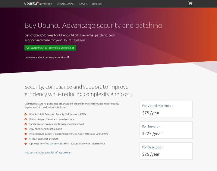
Using the Vanilla design system, we built and released a new theme for buy.ubuntu.com, replacing the much older design.
Old design:

New design:
Robotics blog thumbnail images
We were briefed by the Robotics team to create four thumbnails to use on their blog posts making it more interesting and on-brand.

Brand
The Brand Squad are tasked with updating and managing the overall style of Canonical, Ubuntu and the many fantastic products we create both on and off-line.
Workshops
We had a busy iteration where we held a number of workshops for some exciting upcoming projects like the Anbox branding and the larger brand hierarchy documentation.
Marketing support
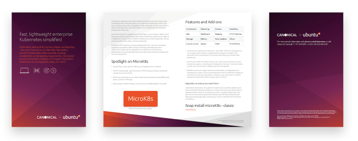
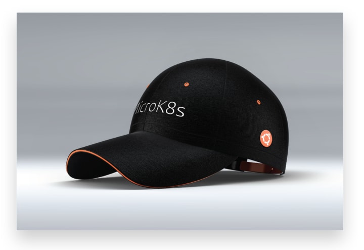
There were a number of exhibitions in this iteration with lots of material needed producing to support them.



Slide Deck 2.0
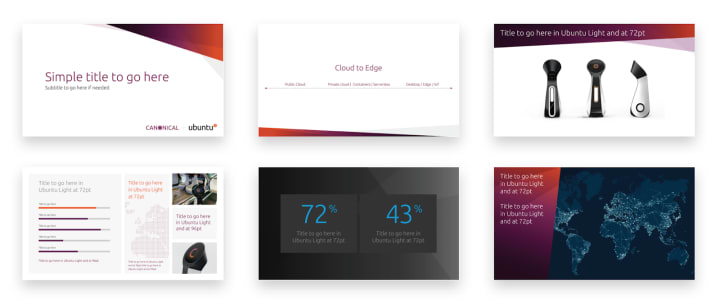
We have been working hard on an update to the slide deck to make it even easier for everyone across the company to produce great looking decks. The first stage of this was and analysis of our current deck and those of other large organisations, making recommendations and then designing new slide and updating others. The next iteration will see the production of those designs.
Illustrations
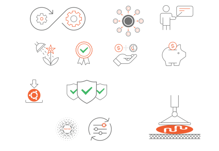
We continue to refine and develop our new illustration style with the production of some new ones and the update of previous designs to the new style of line weight, colours and corner radiuses.
MAAS
The MAAS squad develop the UI for the maas project.
As we’re getting closer to the next Roadmap Sprint we are completely focused on finishing up the remaining roadmap items – NUMA, Link and bond network testing, Separating the UI from maas-core, and Improving UI network discovery. Unfortunately for four of those we require work from the core engineers, which we are still waiting on, thus did not manage to complete all the work we had planned on. The good news is that we are very close to wrapping everything up!
This iteration we completed the UX and design of the new configuration page that will be added to the Network discovery page. It will allow users to at-a-glance see which subnets are actively scanned by MAAS and how often this happens. This work will be implemented next iteration.

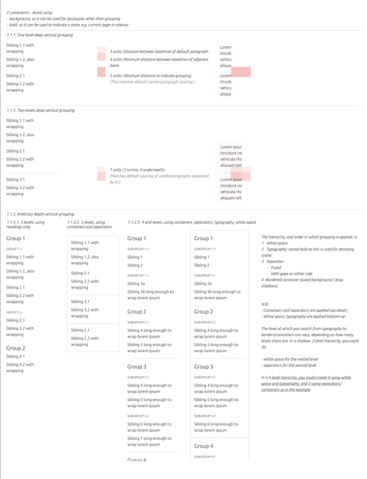
We also explored in detail what would the implications of introducing white background, across the suite of applications we have, be.
JAAS
The JAAS squad develops the UI for the JAAS store and Juju GUI projects.
JAAS Dashboard
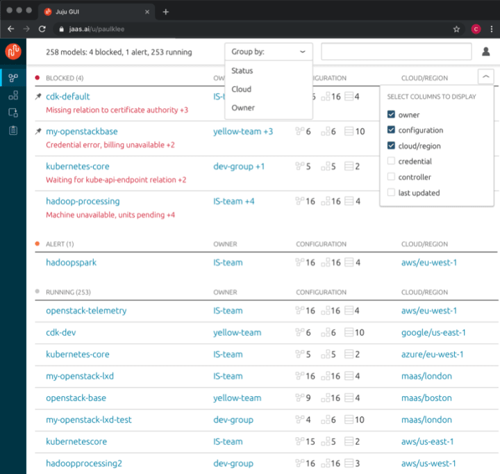
The team worked on the new Dashboard for administrator monitoring of models and controllers, iterating the findings from interviews and user testing. We also worked on the visual design for the UI and on the responsiveness of data and interactions.

Juju.is
The team worked with the Juju core team in order to reorganise the content of the docs, migrating Juju docs to juju.is, and the content of the new homepage. Jaas.ai will keep docs about JAAS itself and charms (the current Charm Store is still under jaas.ai).
CharmHub.io
We worked on user testing for homepage, charm/bundle detail pages and publisher flow. We could collect useful feedback and information from the OpenStack and Kubernetes teams and we are planning to iterate on the findings. We also worked on the visual design language, aligning it with the overall Juju branding and Snapcraft UI.

Vanilla
The Vanilla squad design and maintain the design system and Vanilla framework library. They ensure a consistent style throughout web assets.
Introducing v2.4.1
A new version of Vanilla is now available. Our latest release includes adding dark theme support to our sub-navigation component and global padding under tables to correct vertical spacing.
Color theming system
We now have a documentation page explaining how theming can be applied in Vanilla, introducing a theming mechanism. The current default for all patterns is referred to as the light theme. A subset of elements and patterns now offer a dark theme.
Find out how you can theme your project
Vanilla UI Sketch Kit
Updates include a new layout to align to our documentation site, new components added including pagination and labels as well as some bug fixes we found with Anima.
Snapcraft
The Snapcraft team works closely with the snap store team to develop and maintain the snap store website.
Launchpad builds view for snap releases
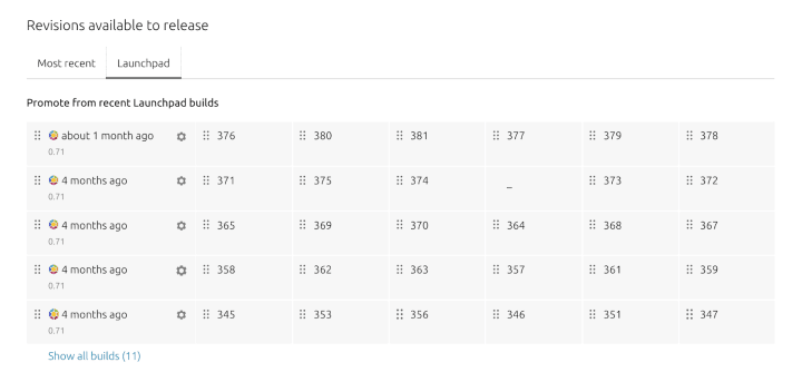
Our recent work is focused on updates to snap releases page. First part of the updates was adding a new tab with the history of all the revisions build on Launchpad. This gives publisher direct access to revisions built automatically, so they can be released or promoted quicker.
Snap pages for Red Hat Enterprise Linux
We also added snap pages to help users of Red Hat Enterprise Linux with specific instructions.


